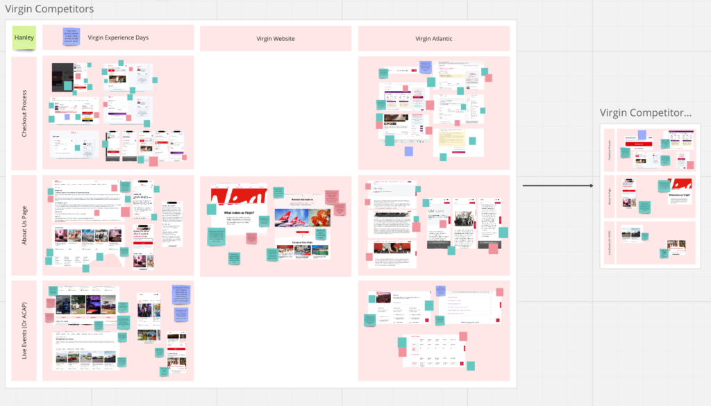
After the communication section was done, it was then time for me to move onto research. We had done a lot of research for this project, however some changes made didn’t always have perfect usability reasoning, and so, they needed to be backed up by research in order to be fundamentally reasonable.
Guest Checkout Effectiveness
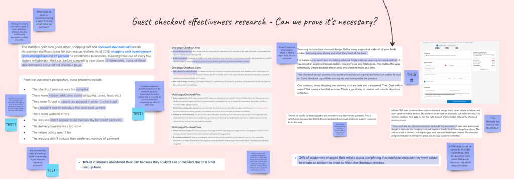
One thing VW are fond of is their lack of guest checkout. Graham saw it as taking away from the experience and doesn’t allow them to properly track analytics. However, from research initially it was clear that a guest checkout is the most valued way forward – with 72% of empty baskets being due to ‘endless’ checkout processes. It was therefore up to me to prove that a guest checkout was effective, and kept within the wants of VW.
For this, I used a tests regarding whether the user would be able to remember information regarding their purchase whilst they go through the process of signing up. This was a different test, however helped me understand whether users (under the assumption that they are not all wine connesseurs):
A. looked for guest checkouts using a heat map
B. could recall information after the process of sign up (this was because research proves that 52% of people will abandon a cart after they cannot remember or visualise what was actually in it.
Position of Voucher Code
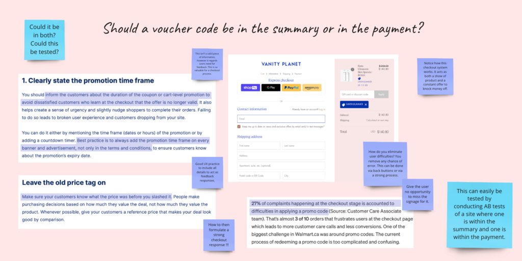
The voucher code was another small but important detail that could make or break a user experience. The team wasn’t sure whether it should be within payment or within summary, and so using heat mapping, I found the speed and the then assumptions of where it should be from 5 different users in a very simple AB test. I used a heat map within Figma to do this, and found where the users mouse hovered the most.
These were just two of the few tests I conducted during the time of design!
Helping the Design Team
Whilst I didn’t directly work on design and cannot take credit for their (incredible) work, through my research and testing, myself and Robert knew the most about the little tweaks in designs that would be needed. For this to be of any use, we went through and made slight changes, before we could get the final versions from the group for a heuristic evaluation.

For example, here, the ‘become a member’ was added by myself to utilise the opportunity for virgin wines to gain information from guest checkout. This could then help analytically and aid the reasoning for a guest checkout. As well as that, slight things such as a fade to show there is more in cart were added, as well as some copy size changes to aid usability, and a few other comments.
These changes were all made through the help of research done in a full heuristic evaluation – found in the below section!
Heuristic Evaluation of Our Redesign
In order to aid the design team further and help with any details or usability issues they or the user may be facing, I did a full heuristic evaluation of the (at the time) current redesigns.

From this I gathered a few key usability changes, including compatibility between desktop and mobile, some placement issues, and user flow problems.
After creating the slide-deck for the team so they could focus on design work, and aiding in the creation of a script, this heuristic markup as well as further research and aid in small development details on the design were my final interactions with the Virgin Wines project before the big presentation!