This project was given not individually but as group and I’m in a group with Maisy, Dom, Rob, Sihina and Rishabh. The task is about redesigning 3 pages of VirginWines which is “event page”, “About us page” and “Checkout page”. Research need to be done regarding the product and website (evaluate and iterate is vital) to understand the problem occur. Maisy has divide our works into categories, individually and in smaller groups for extensive view and opinions.
Heuristic Markups & Analysis
For Heuristic Markup we did this together because everyone has their own comment regarding the page and potential of being overlook by the problems that site had is lesser. I’ve evaluate two pages which is the wine tasting “event page” and the “about us page” both desktop and mobile. I’ve pointed out some notable changes with yellow sticky note throughout my whole analysis as a chance for a better redesign that could give a better experience for users. My comments are mostly design wise but there are some obvious experience-wise need to be highlighted. Basically how I evaluate the pages is by roaming around the site and jot down every confusion i had when exploring so that i don’t missed out any unsatisfying experience i had. Same goes to the mobile as well.
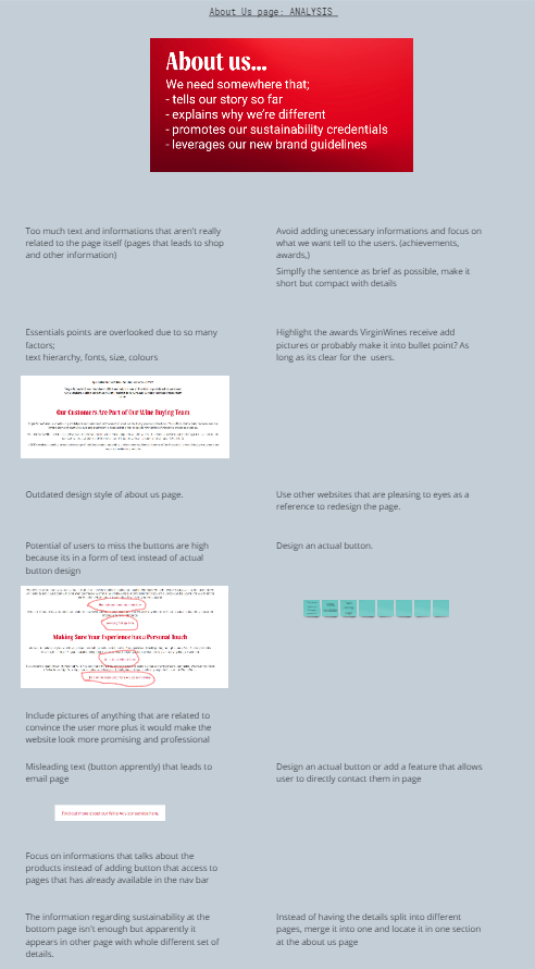
After i did the markups, I analyse the “about us” page. Same method i did with markups but i elaborate the problems and opportunity of improvements in redesigning the page. As i go through the page some of it are quite irrelevant and especially the buttons, it doesn’t actually tells the user about the product but instead it leds the user into other things. Which actually defeats the whole purpose of the page itself.
Userflows
I study the sitemap of the three pages and note down its flow and i find it very confusing and scattered. Some pages that were led isn’t actually relevant to the title page for example, about us page leds user to the shop. It’s unecessary since the shop can be access from their own navigation bar. This actually gives user a bad experience due to it being unrelated and some pages also when tapping the button, leds use rto the same point as well. I jot down every directory of pages as detail as possible and add it into the userflow to proof my point of how confusing it could get. This will help us during the redesigning phase where we could improvise the page to become more linear and systematic.
User Interviews
I’ll start by highlighting and put markups on Dom’s interview so that I wouldn’t miss any points that were said by them. I realize that online shopping doesn’t really benefit as lots of people prefer to taste test plus if it’s an old person, tech would be troublesome for them. One thing that come in handy for online is that if they needed something that requires immediate search (specific wine brand) then that would benefit the most for them. Other than that, in terms of wine events, that absolutely enjoy it since it would vary their taste to wine.So online purchasing for wine taste would definitely benefit the company.
Competitor Review
There are 5 brands that would rival VirginWines and one of it is NakedWines where i was given task to do bits of research about it. Basically i study what the products are and analyse their pages, get some inspiration and reference which can be implement in VirginWines. There are some interesting i found about NakedWines, well my favourite one is when we’re looking up the wines, bottles have a very subtle animation when hover over and that’s where i got the idea to put interactive motion in VirginWines for the site to be more lively. Plus I learn that NakedWines delivers consumers purchase by themselves, which i find it very nice especially since they will know the whereabouts of our purchase and with that they would inform buyers if there’s any delay of they’re orders. This would gain buyers trust even more and makes them look very professional.