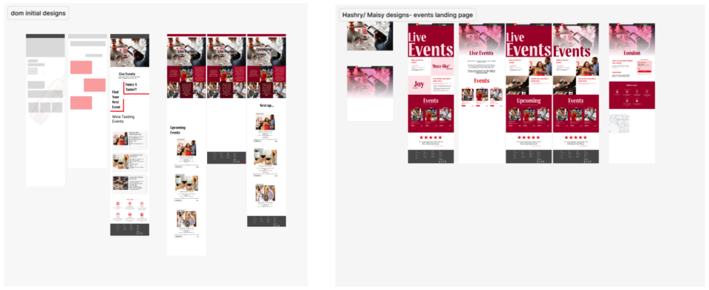
Wine Events (Desktop)
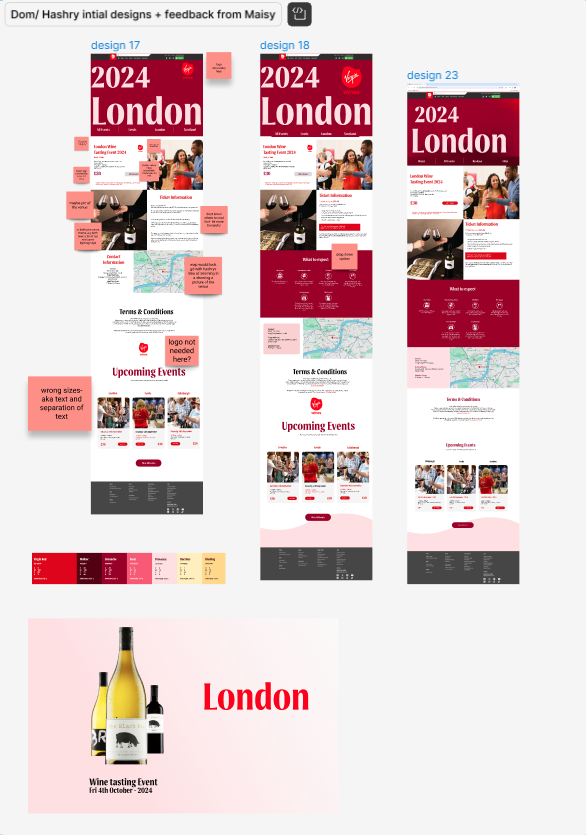
My main role in this part of project is interactivity and dynamic motion of the page. However, I will still have to sketch an idea of the page so that we could combine our design into one. I have to sketch an “event landing” page but we decided to proceed with Dom’s design. Although, Maisy and i made some redesign like remove a few bits and reorganize the details on the page.
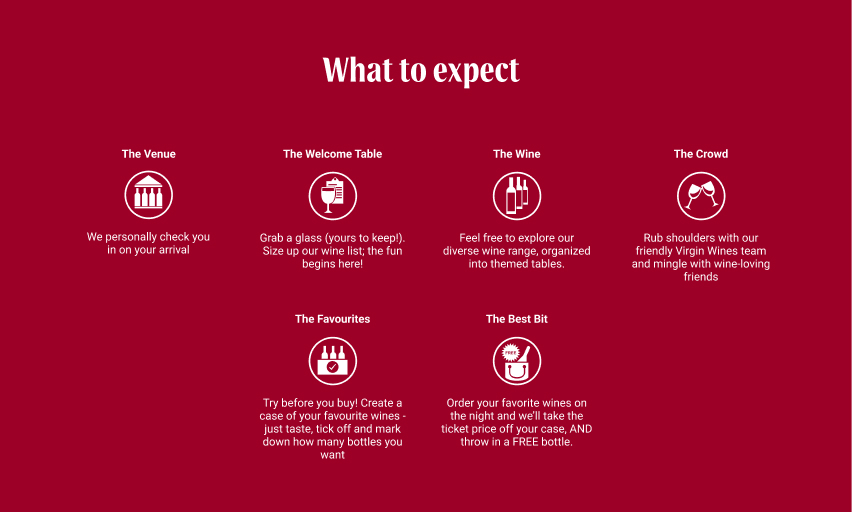
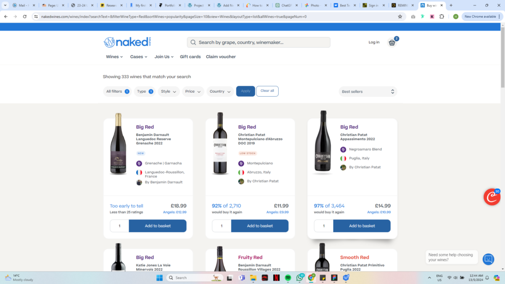
In “What to expect” i decided to change the colour that suits with theme of the page (depending on the majority colour used on the page) and I’ve added subtle animation on the icons. I got this idea from NakedWines where they have slight animation of the bottles moving when hover over it.
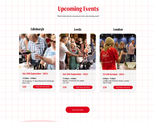
For the individual events page me and Dom made our own design and we combine our ideas together. I added a feature on the map where users are able to see the building of the event held by tapping the pin. (pin with “tap to see building”). And ive added a CTA that leads directly to google maps.I redesign the event details for other location to make it seem more organize, noticeable and doesn’t take lots of space.
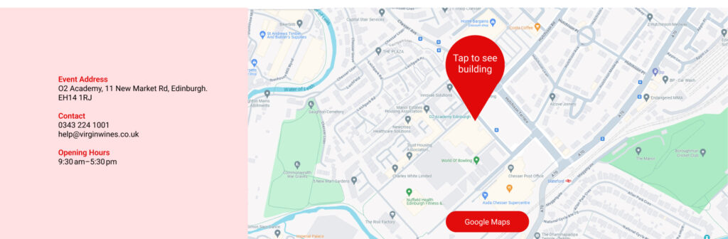
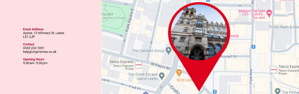
After tapping “tap to see building”
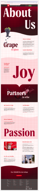
About us (Desktop)
As for about us page, Maisy did the design while I was focusing on adding motion on the big text. I tried to apply each words with different motion that can relate to the text. I also did some research and some of my animations were inspired from the site webflow. Link to the page – https://webflow.com/made-in-webflow/text-animation
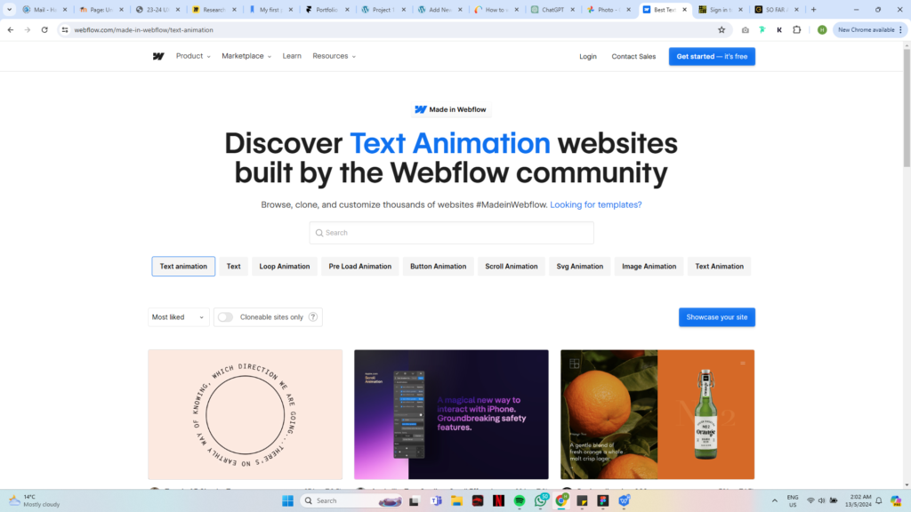
Lastly, I add red highlight as well on the nav bar so user wont be confuse which page they’re on. Meanwhile, if we hover over the nav it will change into red with an underline red colour.

Wine Events (Mobile)
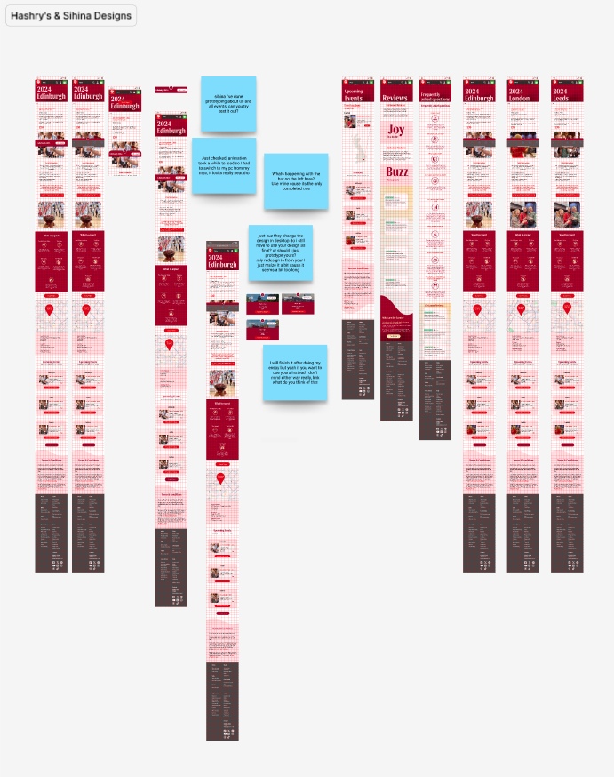
Similar to desktop, I redesign Dom’s initial just by minimizing each segment of the page to make it more shorter. I implement the map feature from the desktop as well for consistency.
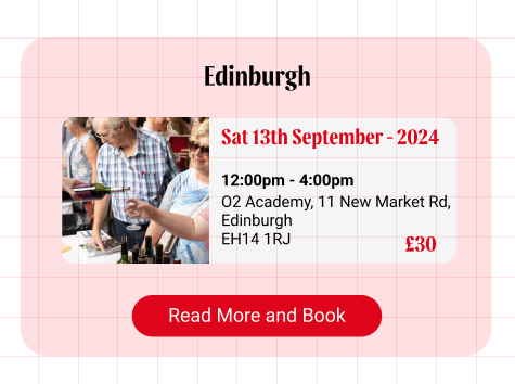
For individual events selection,although my idea was scrap off but my idea was to make it slightly bigger because there are some users have their left as as dominant. So instead of making the button on the left, i align it center, bigger, easier for users to tap.
Side Navigation Bar (Mobile)
On desktop, a new sub navigation was added within the wine events page that lets users to read reviews, FAQs about the event and individual events. We just add it below the original nav bar and make it stick together with it
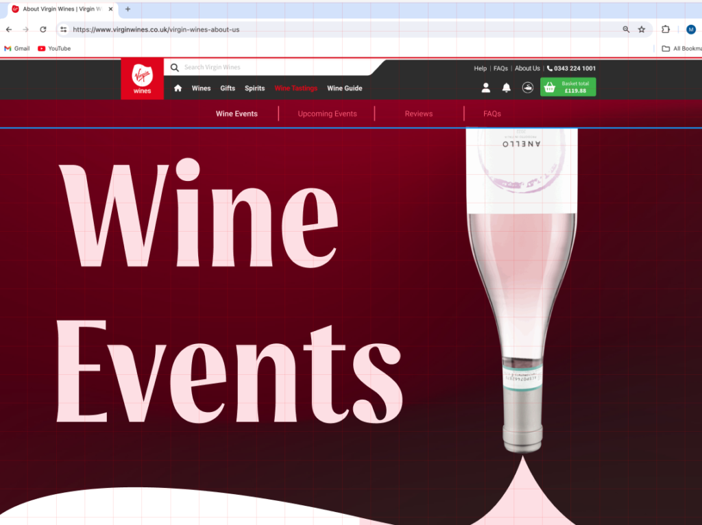
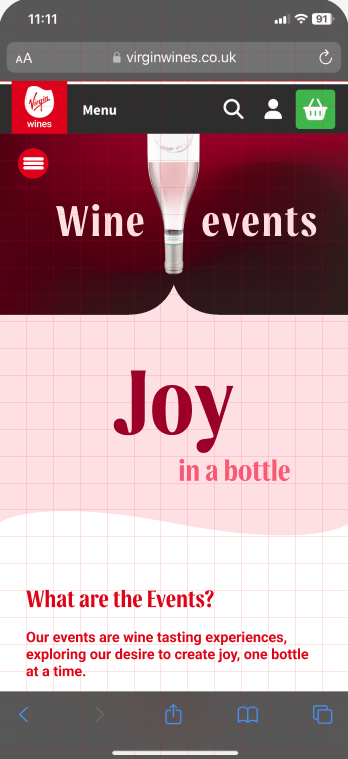
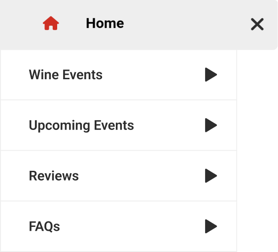
However, since mobile has small screen there is no possible spot to place our new nav, so we decided to add an assistive touch with a hamburger icon menu that functions similar like the VirginWines menu. Tapping the hamburger icon will make a special side menu bar appear sliding in from the left. The side bar only contains pages that are related with wine events so users know they’re only within the area of wine events page. I retain the design of the bar as well since it only appear in this specific page, I reckon not to have any unique design on the menu.
Dynamic Motion Text
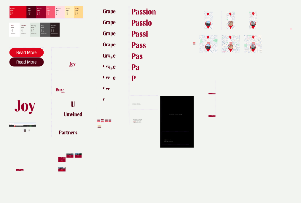
As I said before, my main role was to apply motion on the text or any features that needed to be animate. It was actually quite easy as long as i understand how to play with the settings. Basically what i did was set “mouse enter” on each words that requires the animation and set all effects to smart animate. All components were done by me, words like “Grape” and “Passion” was quite hard since i have to animate each letter one by one and i need to make it into more than one variants.
Prototype (Desktop and Mobile)
Once the design are fixed and the components are done. I can move on to my final task which is prototyping the site to make it function and test the site on few people to see if any improvements needed.