Final phase of project 3, designing high fidelity for the website. As mentioned in the previous post (project 3 visual ideation) i’ll be designing an experience website about red dead redemption festival. It’s a site for user to make table reservation and enjoy their meal at a fancy saloon that’s fully inspired from the game. The foods, drinks, environment, building and etc.
Analyzing Game Designs
First and foremost i analyze the gaming design, the fonts, graphic and interactivity that are available in the game and it seems that it’s impossible for me to replicate their design if i fully depend on figma tools. Their not using simple vectors but instead they use waterpaint, grunge brush, vintage paper texture to recreate 1800s style. Johnny gave me this website where it breaks down all graphics and interaction design from the game for reference. So, I decide to illustrate vectors like frame and button in photoshop and illustrator. As for the font, I looked up on google about red dead redemption’s font and download it. I used the font “Chinese Rocks” as header, “Kirsty” for topics and buttons and “Roboto Slob” for any descriptions.
https://www.gameuidatabase.com/gameData.php?id=34
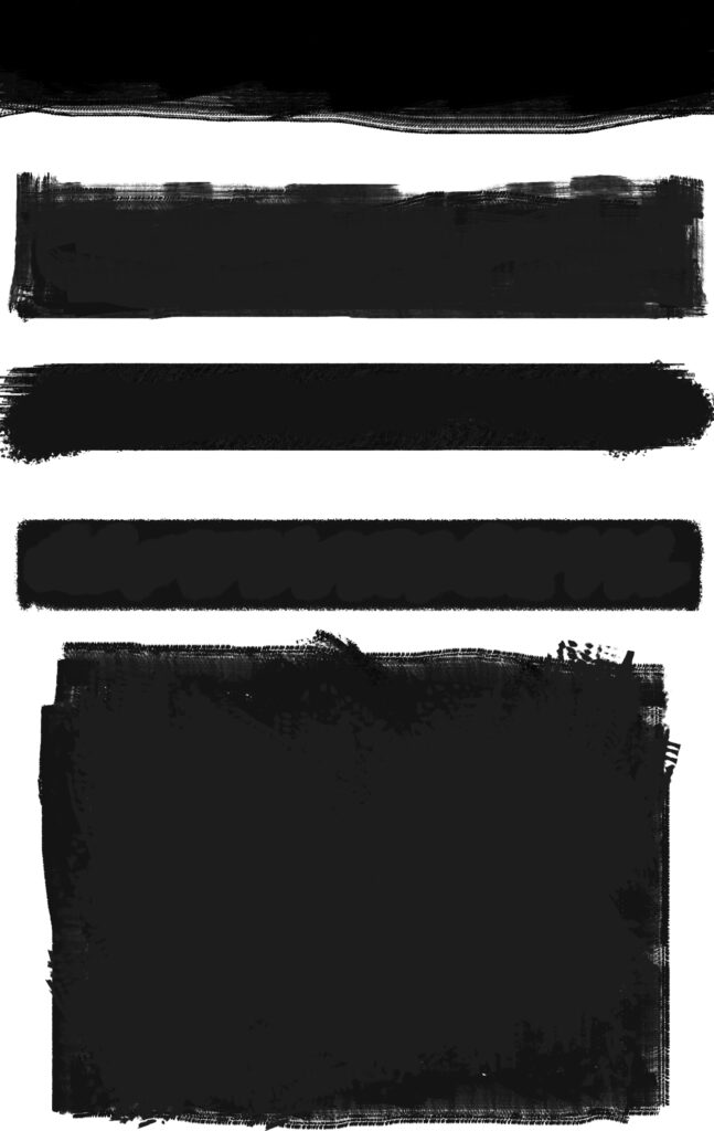
Illustrations i did to replicate Red Dead Redemption graphics
Content Experience
All the description in the website such as the objective, saloons, mission page are all written by me first then i ask ChatGPT to rephrase it into cowboy slang or even better, phrase it as if Arthur Morgan (game protagonist) would describes it or promote it to people around. Sometimes it would be too long or it kept repeating the same words but I’ll asked it to simplify and changed some words with their synonym.
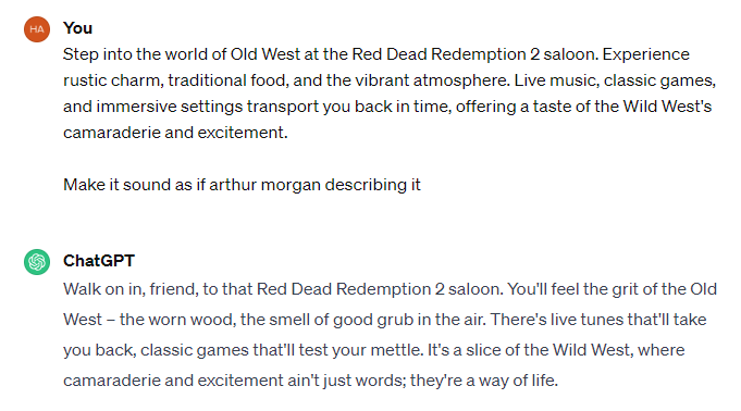
Help from ChatGPT
For the images i asked imagebingcreator to generate it. I would put in the prompts like “Generate an RDR2 festival poster with their the game artstyle” or “Generate a poster of treasure hunt inspired from RDR2” something like that. These picture are used for the ticket poster, background and gameposter, and header picture as well. I tried to put in as much picture as i could to attract the user and less description because i believe user won’t read everything. Short but pack with information.
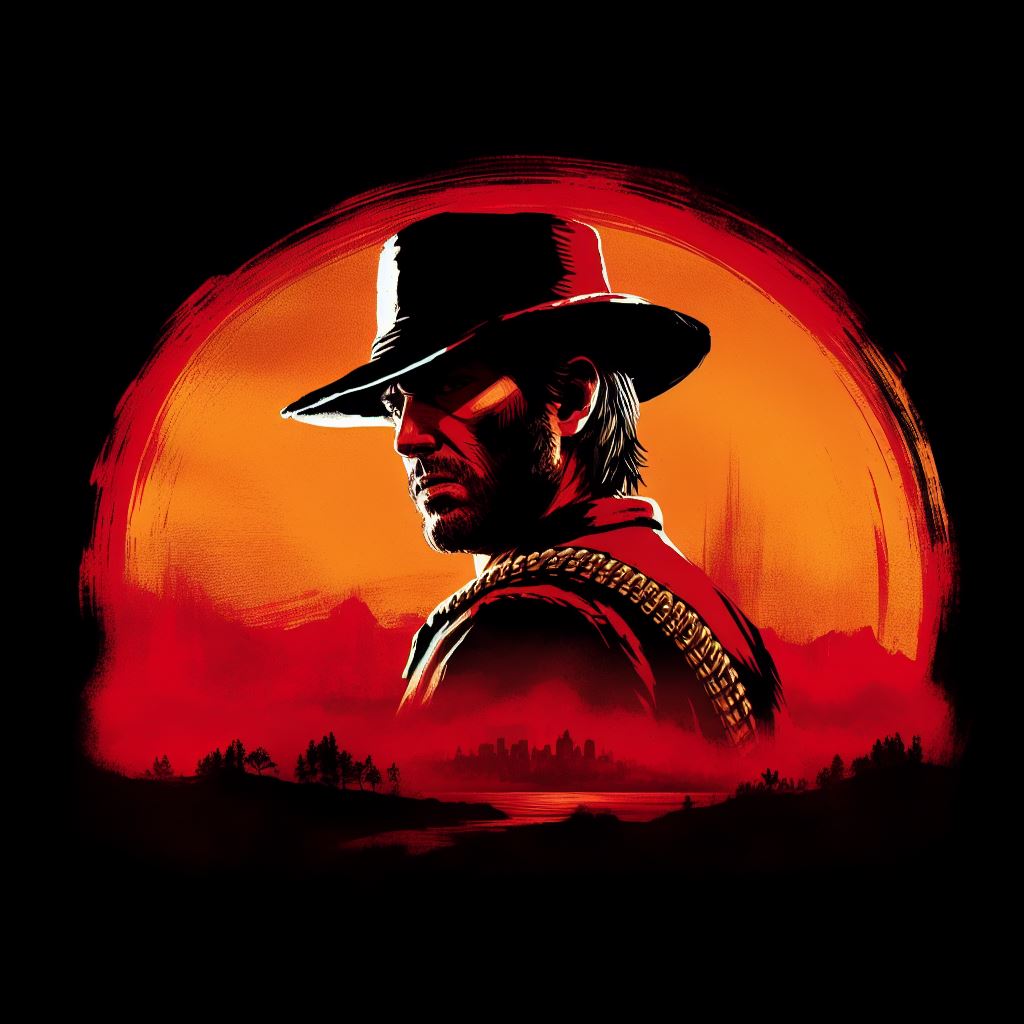
Festival Layout and images
Although it’s a fiction event, I’m aiming to give the best website experience with full of information for the user. I’ve illustrated a map for the event in photoshop so users would plan out their day when attending the event. There’s also indicators at the bottom right for users to know the locations. The map design is fully inspired from the game in terms of the colours and marking (circle icon) from the game. I add crumpled and old paper texture to make it seem more vintage just like how the theme was supposed to be. Other than that, there’s a table layout in restaurant as well for them to book their seating. Simple and easy for user and theres colour difference for reference.Grey is for “available” tables, yellow’s for “unavailable” and green is when user selects it.
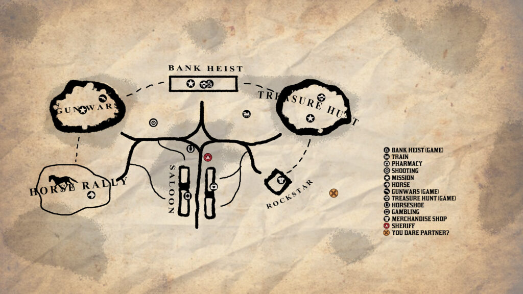
Event map
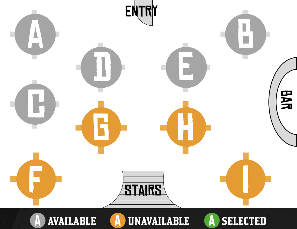
Restaurant layout for table booking
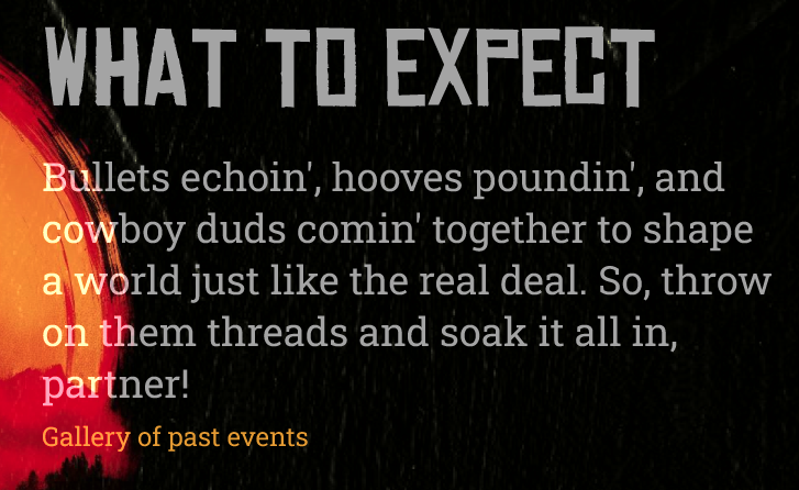
For other relatable images, I basically took it from google for menu,saloons and past events, just to give a hint on what users will be expecting on the day.
Interaction Design
Moving on to the final part which is adding interaction (button functionality). All buttons have an interaction where the mouse hover over it, it either changes colour or image. It’s to emphasize that the ones user hover over is the button. Other than hovering, colour distinction also signifies that it’s a button with statements beforehand.

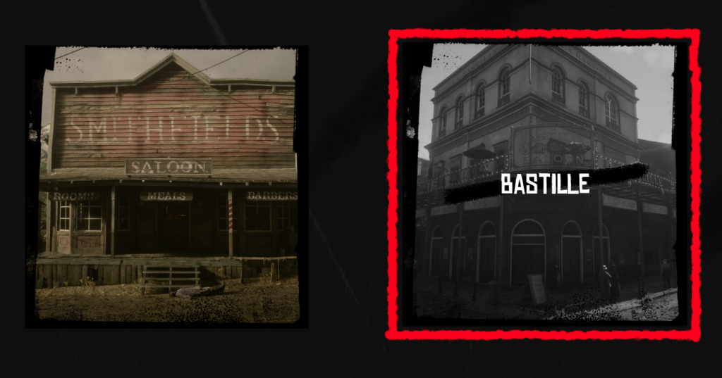
My favorite interaction that i applied is when the user hover over the options of saloon, the colour changes to black and white and the name of the saloon reveals, plus there’s an outline with red colour appear and it is based from the game which is the reason i love it because i manage to copy it.
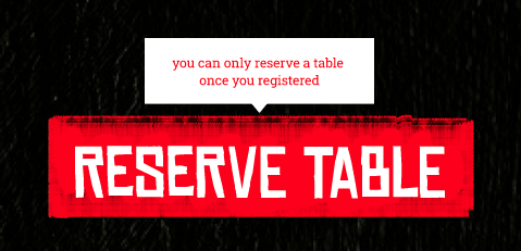
Another favorite interaction i did was adding tooltip. Other than changing colours, there’s an information popped up when the user is hovering at the register button in every saloon page. It’s for the user to be on alert if they want to proceed on their progress and it’s very obvious since the colour is contrast from background
the change of picture. I applied this effect on merchandise and food section for the user to get a glimpse of the product. The cursor